Branding The Art of Science (2012-2018)
The Art of Science was a collaborative project and educational art exhibition in Memphis.
Research scientists from St. Jude Children’s Research Hospital (and later, LeBonheur Children’s Hospital) would compile a directory of images from their research— microscopic photography, scientific diagrams, visuals from lab equipment, or other images. A juried pool of artists would choose an image that intrigues them, work with the scientist to learn more about their research, and then create a piece of art interpreting the scientific image with their newfound context.
The resulting exhibitions were really amazing, displaying these wonderful art/science diptychs, and bringing together two vibrant but often separated communities in Memphis.
I helped start The Art of Science early on, and even participated as an artist one year! Over time, I left the project up to other passionate folks, but I continued to update the branding for each new chapter!
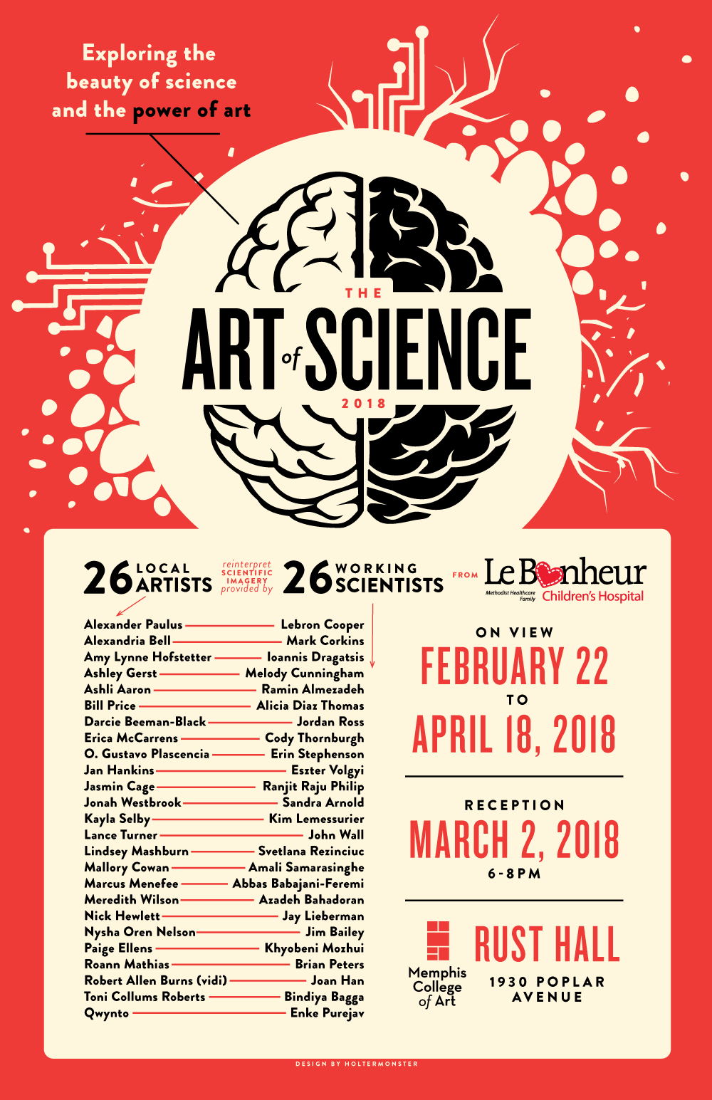
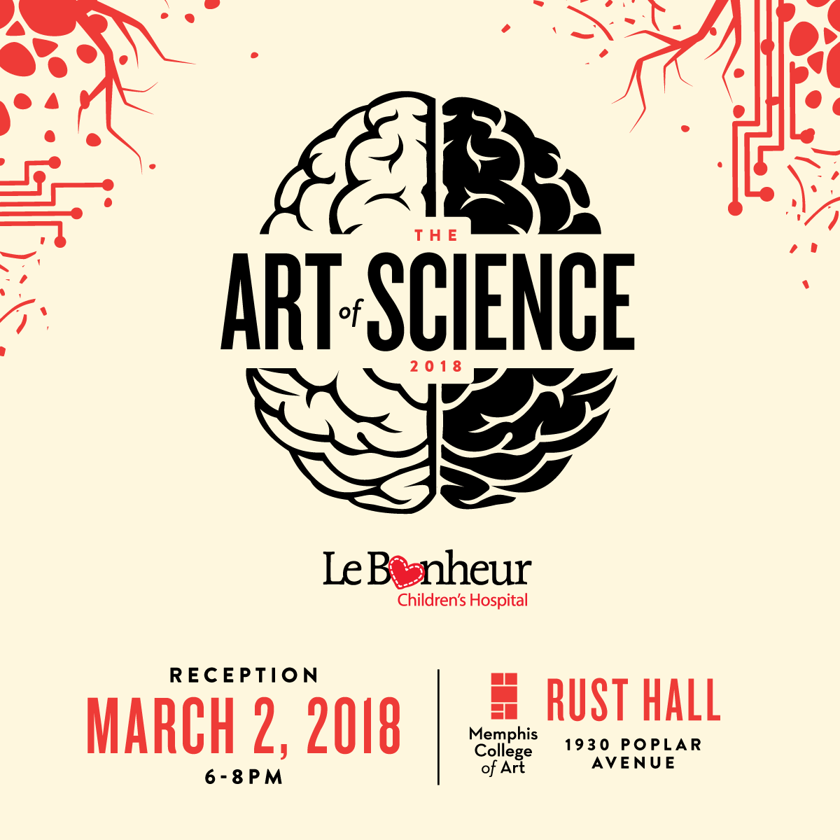
The Art of Science 2018
The Art of Science exhibition pairs local fine artists with working research scientists at Le Bonheur Children's Hospital to learn about their field of study, and reinterpret a relevant scientific image as a piece of art. Both science & art are put on display for an educational experience disguised as a powerful art exhibition. I am very proud to have been the designer for AOS again in 2018 for its fifth installment.
The Art of Science 2016
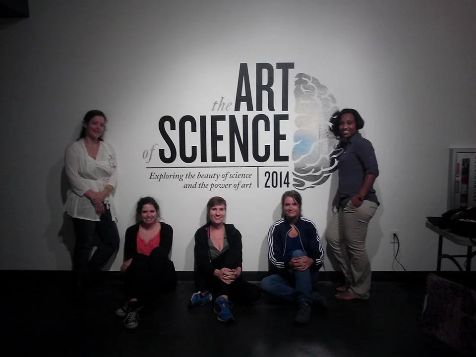
The Art of Science 2014
For the 2014 Art of Science, I decided to update the branding to be more flexible across various sized applications. We also took a departure from the signature red in favor of a more vibrant purple, not unlike the bright colored dyes used to identify certain entities in microscopic imagery.
the 2014 Art of Science featured art from 27 scientists and 27 artists
part of the 2014 update to the Art of Science branding was the addition of a tagline: "Exploring the beauty of science and the power of art."
The Art of Science 2013
the logo for Art of Science 2013 is updated from 2012 with more sophisticated typography and a more playful shade of red—a change from the elegant but mature shade of maroon from 2012.
The 2013 Art of Science featured scientific imagery by 28 scientists & art from 29 artists.
The Art of Science 2012
The 2012 Art of Science logo was a more refined and deliberate iteration of the original 2011 logo. The bright stencil red from 2011 was updated to a classier and more serious maroon on a gritty concrete texture, visually implying the maturation between years one and two of the project.


