Branding Monster Market (2017-2022)
Monster Market is an annual curated pop-up retail experience curated by me!—Holtermonster. I carry a juried selection of art, apparel and novelties from weirdo makers, artists, designers, and small brands all over the country. The pop-up appears somewhere new in Memphis, TN each year and is open only for the month of October. Over the years we’ve been an in-person shop, an online store, and in 2022, we had our first hybrid year, with an in-person event to kick-off the virtual season.
In addition to curating the stock, arranging the store, and manning the register, I also brand Monster Market and design all the collateral throughout the year. This is a labor of love project that I’ve had the pleasure of evolving year to year. Check out the journey below~
Monster Market (2017)
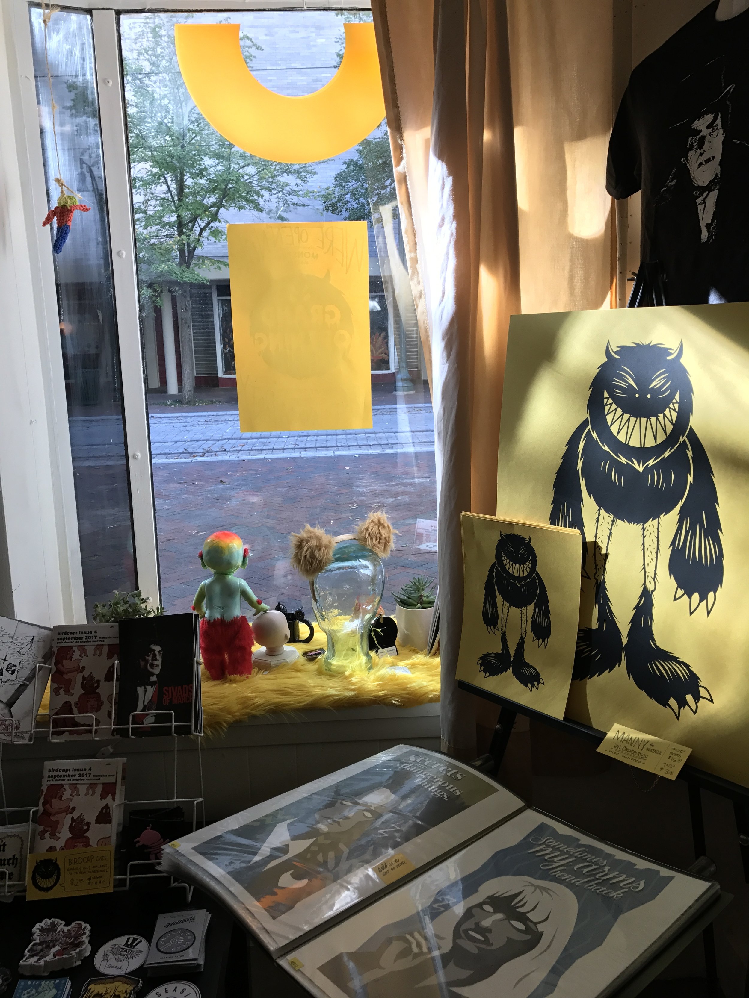
The brand identity was built this first year— I tried to encompass everything that we’d need to brand the experience with a cohesive branding campaign. I created the mascot, Manny Monster, and incorporated him into everything, from the logo system and the packaging, to the merchandise and the signage on the first pop-up shop at 88 N. Main!
Flat Lay— Paper goods, packaging, signage, and stickers for Monster Market 2017.
Outside 88 N. Main— Signage and posters at the first pop-up in 2017!
Inside 88 N. Main— Screenprinted monster prints for sale.
Color Story— Pulling the brand yellow into the store design.
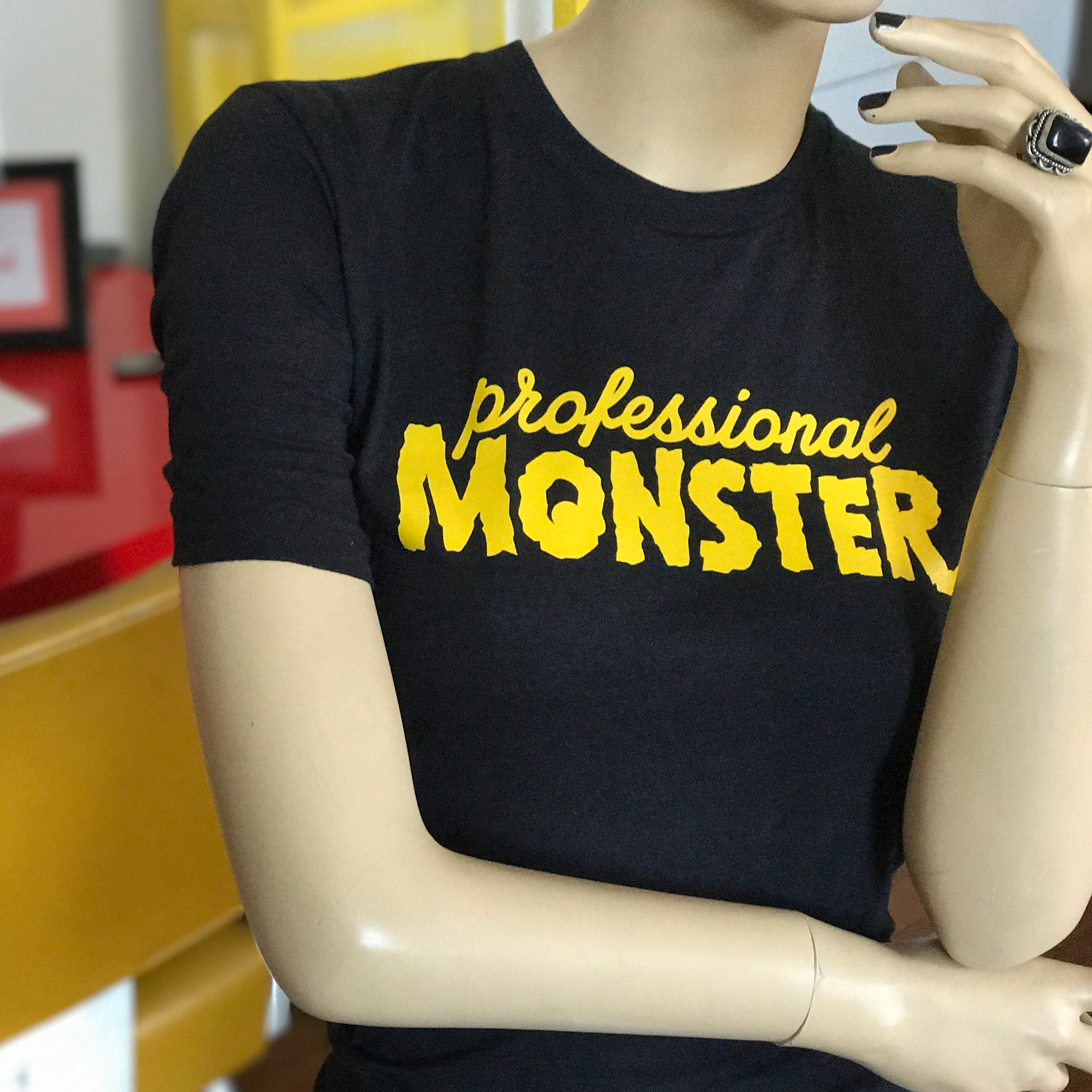
Professional Monster shirts
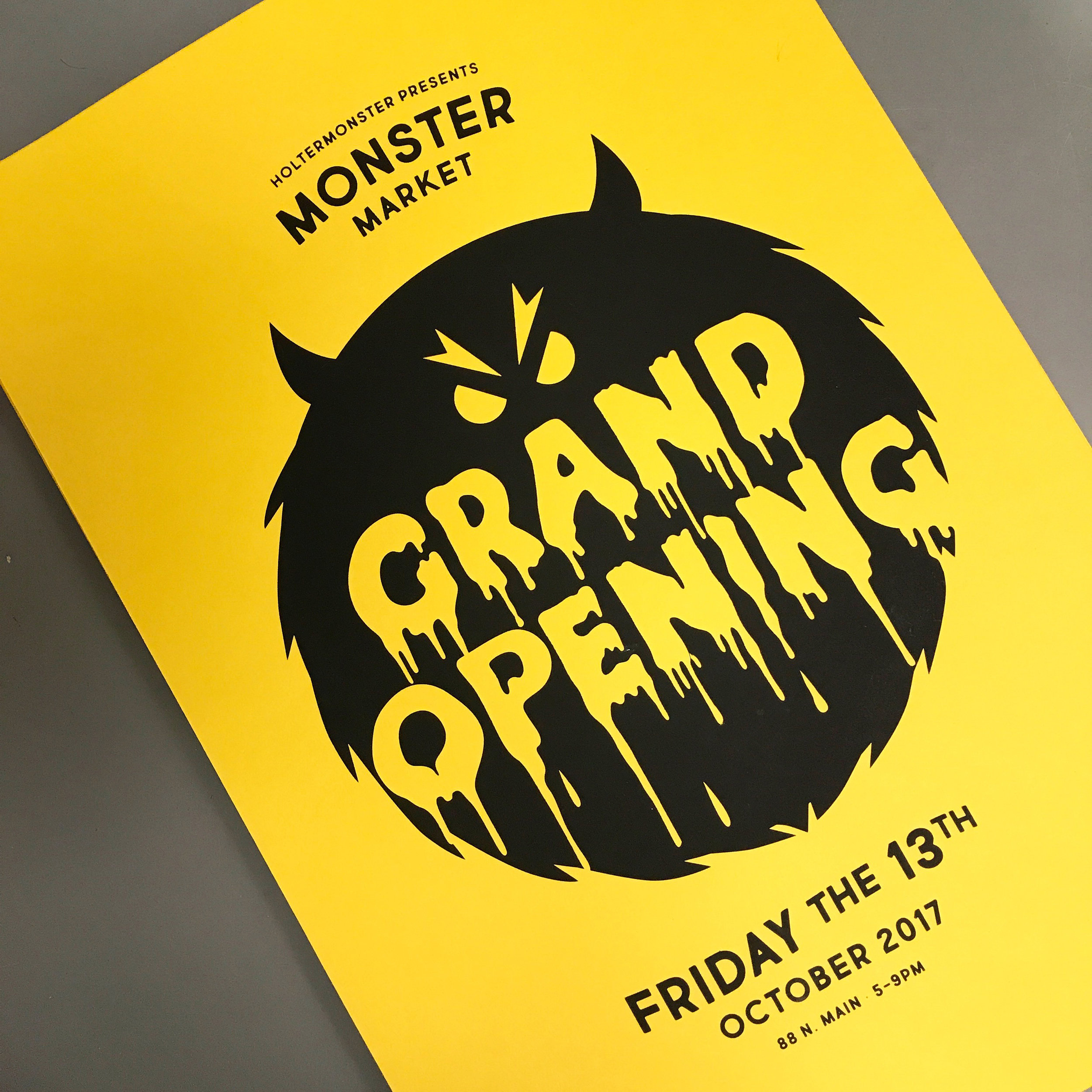
Screenprinted Grand Opening posters
Monster stickers and pins on our signature yellow fur for our first year
Monster Market (2018)
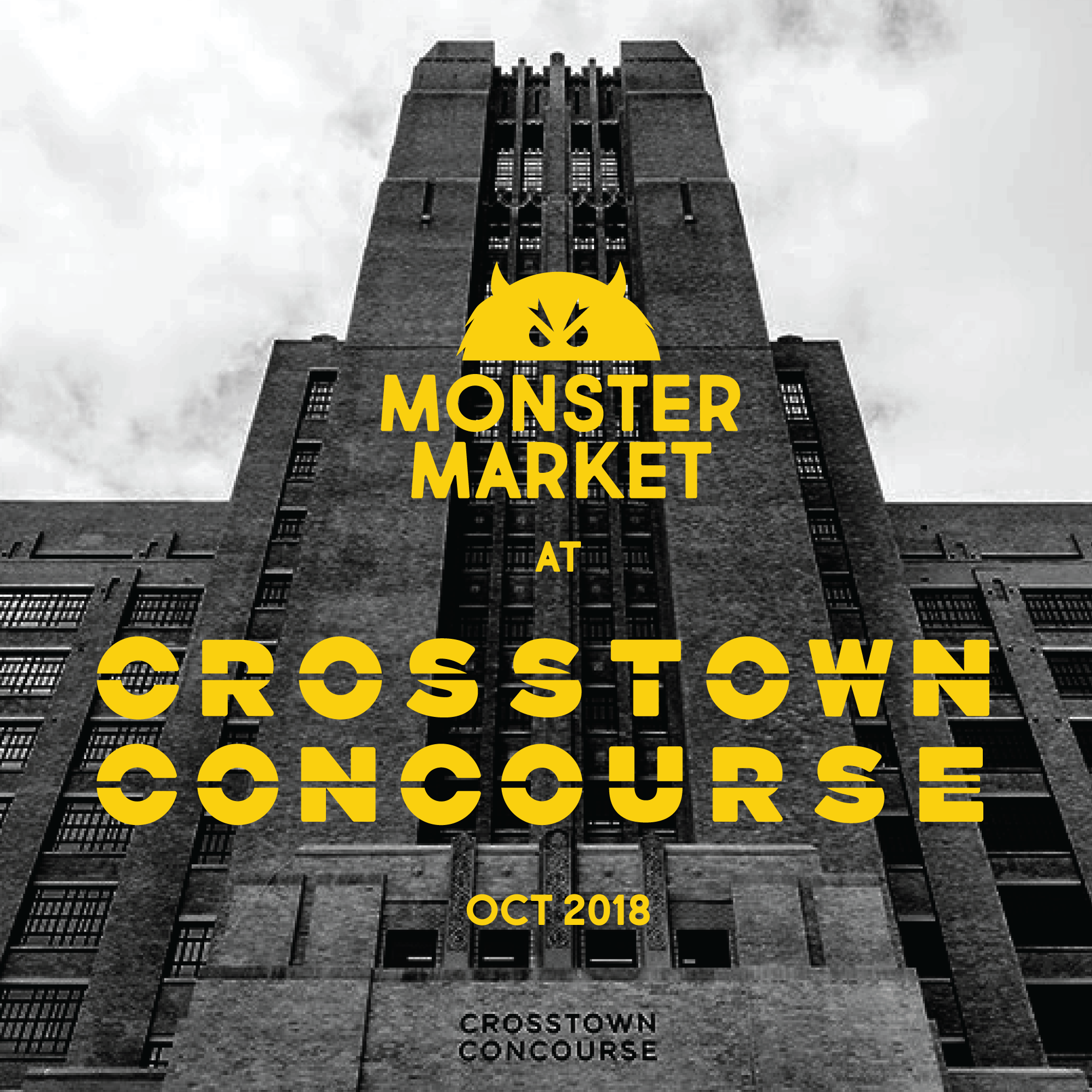
In 2018, Monster Market happened in the Crosstown Concourse— this huge old converted Sears Building.
The tall looming tower inspired a Twilight Zone-inspired commercial with the help of John Pickle!
There is a 13th dimension beyond that which is known by man. It is a dimension as hairy as hobgoblins and as yellow as yeast yogurt. It is the middle ground between September and November, between odd and the macabre, and it lies between Concourse Ave and N. Watkins St.
This is the dimension of crafted goods. It is an area which we call The Monster Market.
This video spot, inspired fully by Rod Serling’s classic intro to The Twilight Zone, was a collaborative effort— script & acting by Blaine Garrard (Garracula), animation by Holtermonster, and film/editing by John Pickle (Pickle TV).
Another Dimension— I projected and hand painted some distorted text to go along with 2018’s Twilight Zone inspiration
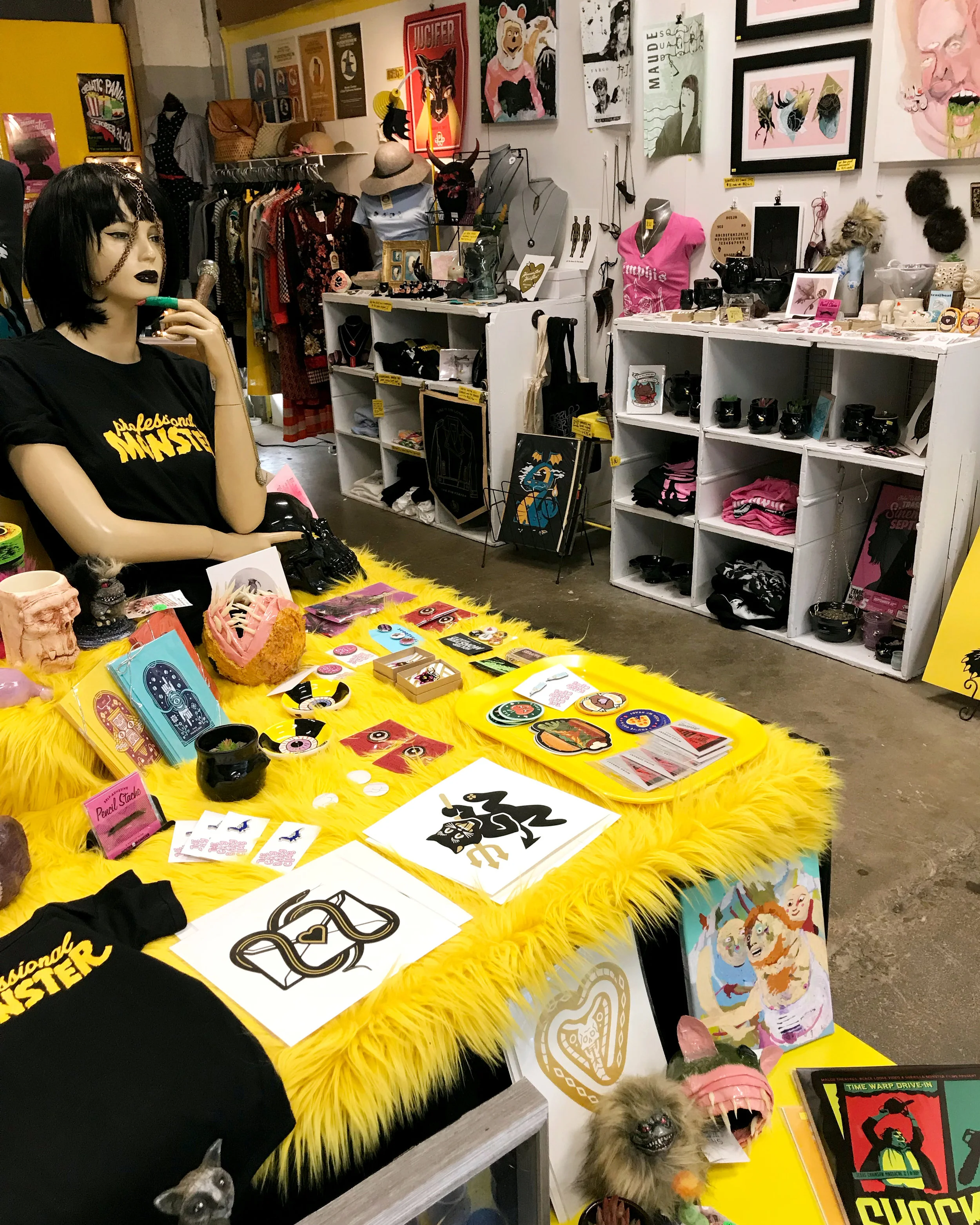
Resident Monster— Created a lifesize Manny vanGrendelstein— handpainted on plywood.
Always Yellow— Accent surfaces of yellow fur in the shop!
Monster Market (2019)
In 2019, I created this fun branding campaign with a pattern of images representing the shop’s range, and incorporated it into the signage for the pop-up shop at 618 S. Main!
Window Shopping— We installed this fun yellow vinyl with illustrations of themes from the shop!
Inside the Fuzzy Den— We expanded the decor with more fur, a creepy mannequin. Also a great shot of the window vinyl from inside!
The yellow and black monster theme seeps into the merchandise too!
Monster Market (2020)
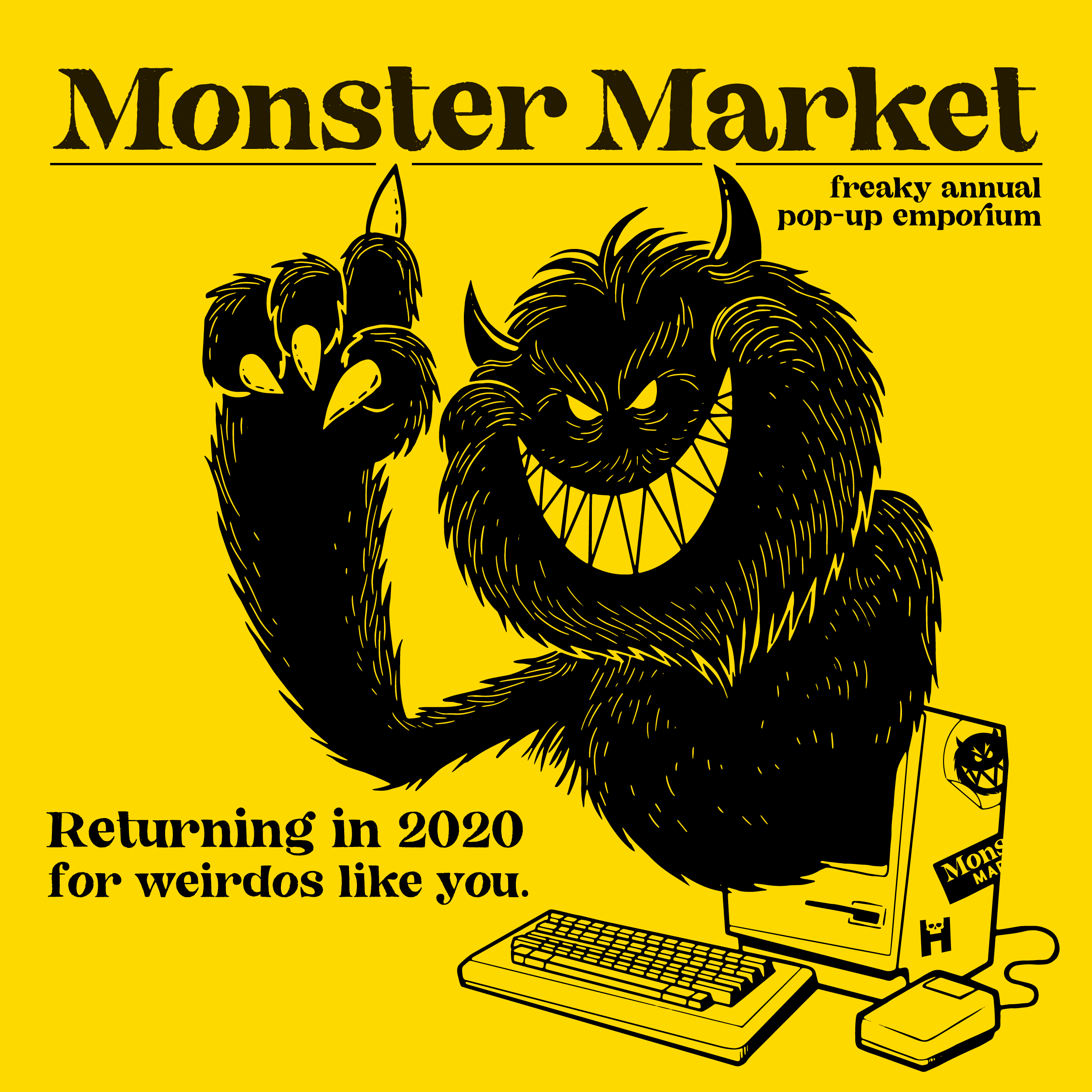
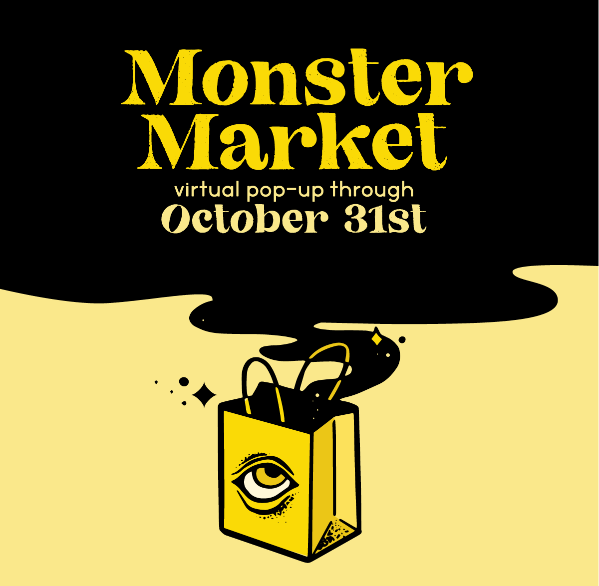
In 2020, we switched to a virtual pop-up shop, so I needed a lot more graphic assets.
I updated our logo, picked a new typeface, and created a series of illustrations for the promotional campaign.
Hear Ye— Illustrated scroll to announce our big switch!
On the web— Promotional illustration for our online debut!
Monster Market (2021)
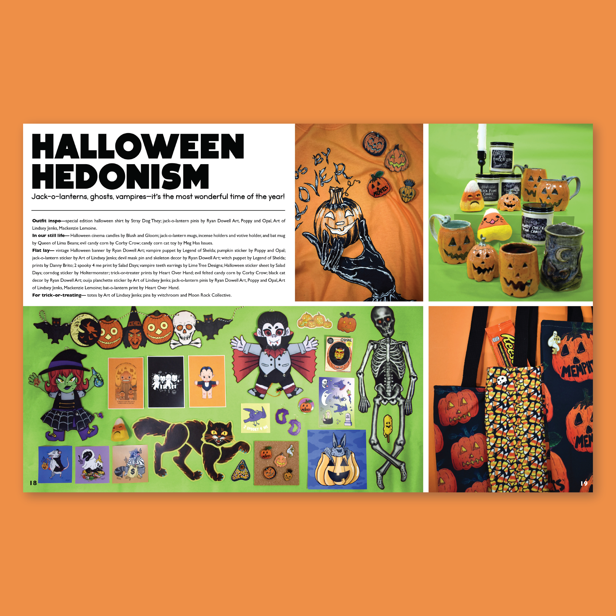
In 2021, I updated the logo system and typeface again with some bolder choices, and created the first-ever Monster Market Lookbook!— a catalog depicting our whole 2021 collection in different styled shoots.
Monster Market (2022)
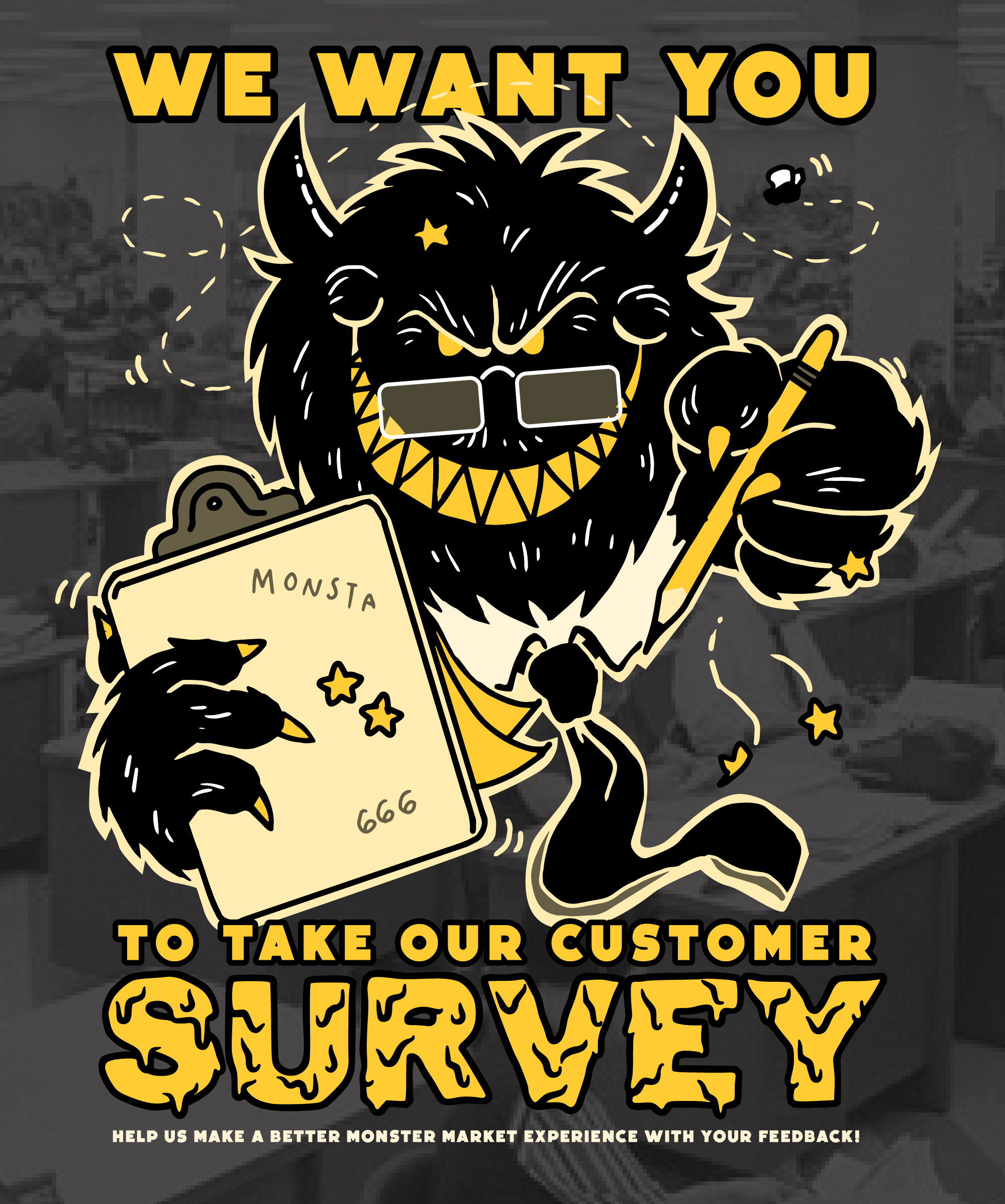
In 2022, I went hog-wild on bold type treatments, leaned into the graphic style of black on yellow hard, and created lots of fun new Manny Monster illustrations.


