
I was named among Women Who Lead in Advertising and Media by Memphis Business Journal! I’m so very honored to be named alongside these business owners and creative powerhouses. Check me out at the end of the article!
Read MoreLocal TV Spot with Celebrity Chef Gina Neely!
I had the pleasure of joining Richard Fudge, President of AAF Memphis, and local celebrity Gina Neely on her show Bluff City Life recently to talk about the 2023 Addy’s and my win with my Time Warp Drive-In posters! What an honor! Thank you, Gina!
Read More
Interviewed by Shoutout Colorado!
I was recently interviewed by Shoutout Colorado about how I got started with Monster Market! Check out the full interview here.
Read MoreBefore & After: Popping Up in Crosstown Concourse

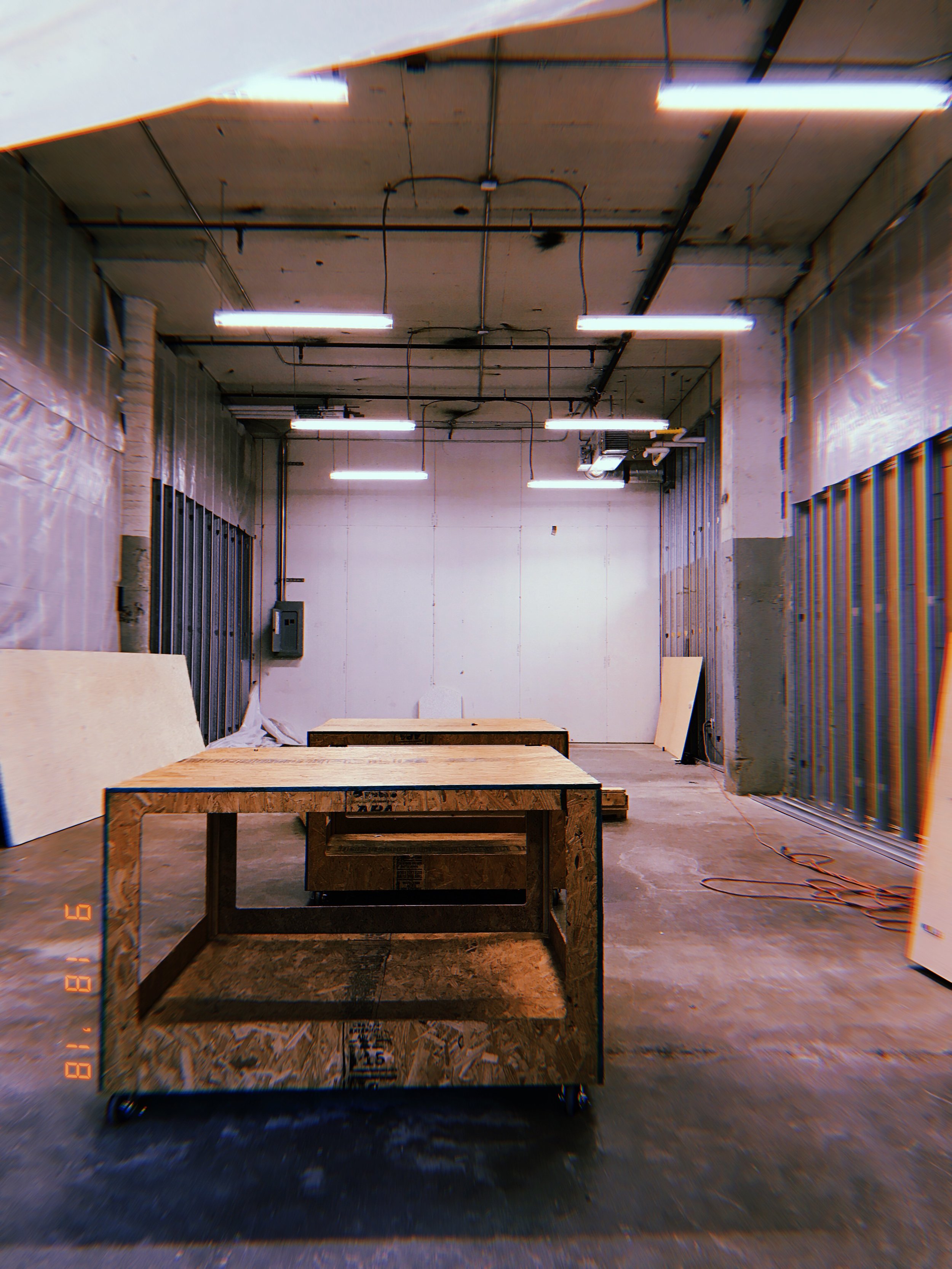
Hosting Monster Market in Crosstown Concourse was a dream— the traffic was good, there were bathrooms (a very important upgrade from 2017’s location), a half dozen good restaurants in the building, real HVAC, parking, accessibility, coffee, and an address people recognized.
But for every perk, there was one big con, and it looked like this:
These rolling display tables left behind by the Bikesmith shop closing were a big help.
That’s the space (above) as I saw it on my first walkthrough— which by luck happened to be on my 30th birthday. It was dirty, being used as free storage by Cedar the Beater, without walls, and without electricity. Upon request, I had two outlets installed. These would power my entire store for the duration of my two month lease. Somehow, this felt like a victory, but there was so much more work ahead of us.
Scared to death of not being able to pull this off in time, I start as early as humanly possible. I get the keys in mid-September and start wrangling this beautiful handmade display furniture recently disposed of in the closing of the Bikesmith.
By now, Cedar (local wife-beating artist that I eventually had words with) has moved into the free studio he’s mooching off of Crosstown to the right, so you can see the backside of his drywall. In the back, he had large panels of wood leaned against the studs implying some kind of wall, but after catching him sneaking more than once, I quickly learned he just wanted them to look like a barrier.
The focus of my floor plan is to section off the space with a dividing wall, creating a hidden back area for storage, staging, and hiding a projector.
Local set builder and old friend Shea Colburn comes to help me for a few days, literally bringing a wall with him! It came with a window originally (right), but I couldn’t come up with a good reason to keep it.
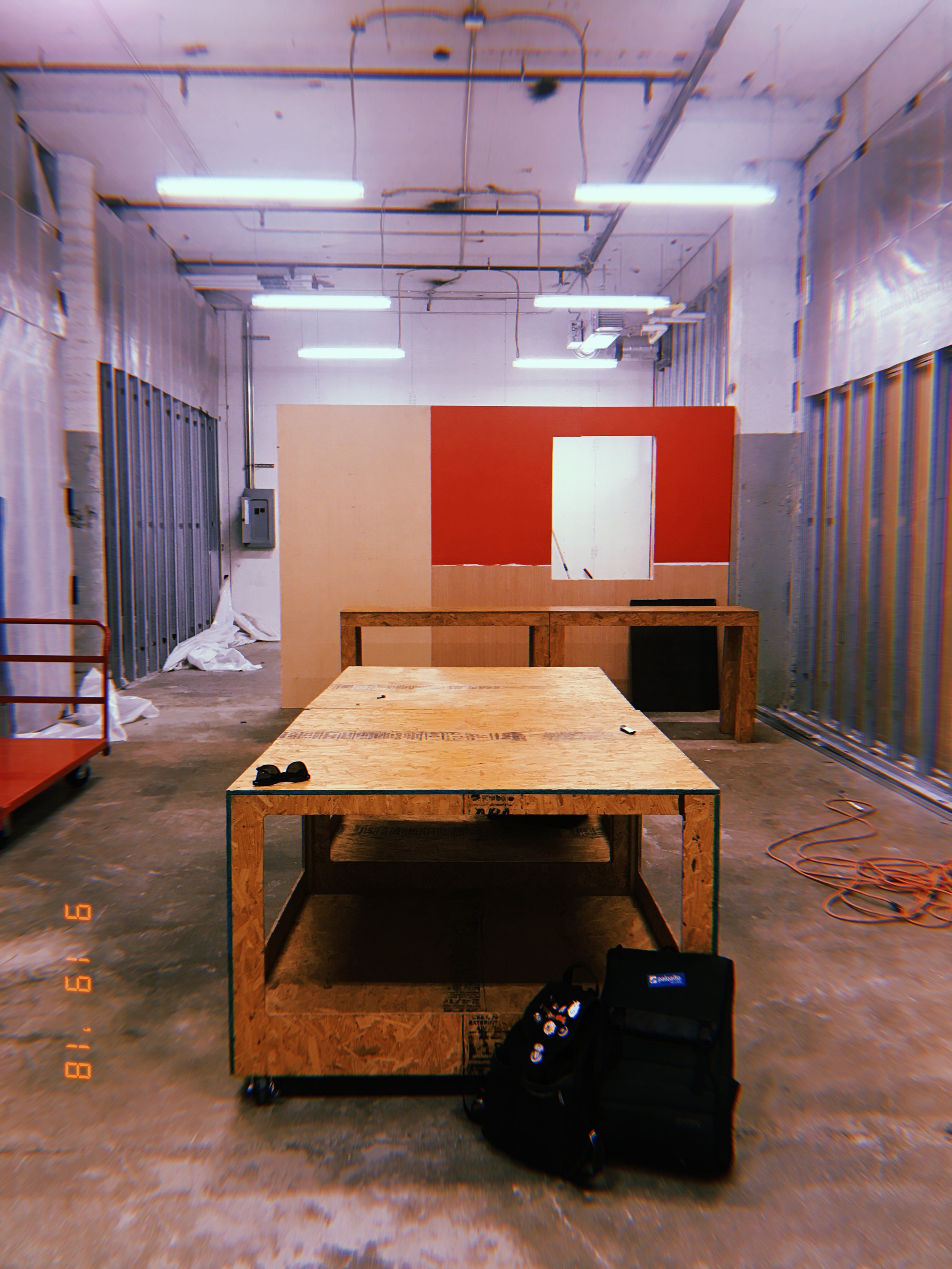

At my request, Shea covers over the window, and my friend/talented local screenprinter Will Loren comes by and paints the whole thing yellow for me.
Inspired by a show I saw in the gallery upstairs with images projected on the backside of visqueen, I ask Shea to build me a massive projector screen, and he somehow already has one of those on hand too, creating a huge spot for a 12 foot projected horror movie to go!
He and my brother Kiefer screw up sheets of MDF into the studs to create walls, and we begin hanging sturdy brown paper over the exposed plastic on the upper halves of the “walls”.
At this point I’ve spent literally all week scrubbing the rat turds and petrified dust off of these ancient shelves from Crosstown Concourse storage (because they didn’t want to let me use anything new) and painting them primer matte white. I have only accidentally given myself paint fume poisoning one time in the process! But this part has taken a lot longer than I’d anticipated. Here we are only a few days from opening and it’s just beginning to come together.

We temporarily disconnect and cap the back 6 flourescent fixtures so the light won’t interfere with the projections. I say we, but I don’t do ladders and I know shit-all about electrical work, so I just watched. This really cuts down on the light in the space, but it’s exactly the look I’m going for. The front half is still illuminated by the tubes, but the back is a bit dimmer.

This is the home stretch here! Just days away from opening, my close friend/display master Reagan Crow comes to the rescue, and helps me organize a thousand or so items into meaningful sections around the store. We settle on something like Goth/Metal/Witchcraft, Creature/Critter/SciFi, Natural/Bones/Mystical, and Feminine/Feminist/Gender-Related. There also ended up being a vintage corner with costume pieces, a cosplay section with tooled leather masks and jewelry, and a t-shirt wall featuring designs from a dozen makers. The middle section currently only has a naked mannequin, but soon we’ll fill this with the fast-selling items like stickers and enamel pins.

And here it is in action! This shot is from the Grand Opening, which always ends up being our largest, craziest, and most well-attended event. The shop is full of patrons and makers, I’m back there behind the register talking to an artist, and I think that’s Poltergeist playing on the projection screen above me.

And here it is near the end of the month. Somewhere in there, I made the time to project and hand paint some lettering on the yellow wall. The big displays stayed the same over the month, but the smaller items have been rearranged a hundred times by this point. I’ve had to borrow the mannequin’s wig, and apparently I’m having trouble keeping this front easel stocked. I think someone had just bought the little Eddie Munster painting moments before!
Was it a lot of work? Yes. Was it worth it? Yes! I was only able to take on something this big with the help of my friends, who allowed me to cobble together their various expertise into a comprehensive effort. That’s the only way big stuff gets done. As much as I wanted to do everything when it comes to Monster Market, I physically can’t! And I’m thankful for that, because it’s a lot more fun sharing this dream with a staff of weirdos.
Holtermonster 2018
It was about time to update the Holtermonster look. Up until now, I've been skating by with a logo set over a developed identity. This is my first stab at a fuller brand.
I particularly wanted to create a strong set of small marks with an updated skull shape and an H.


You Love Me! You Really Love Me!
I designed this poster for Good Grief, a documentary about a children's grief counseling summer camp run here in Memphis. In one ceremony, the children write letters to their deceased loved ones and tie them to yellow balloons, released into the sky. The filmmakers wanted to draw from this imagery to create something bright, simple, and playful. My design won Best Poster Design Audience Choice at the 2017 Indie Memphis Film Festival!
The Eyes Are Not What They Seem

Poster for the Twin Peaks Viewing Party, a series of watch sessions hosted at the Cove Bar on Broad Avenue, presented by Black Lodge Video & the Memphis Film Society.

type treatment & color inspiration


Killer Bob, Audrey Horne, and Agent Cooper
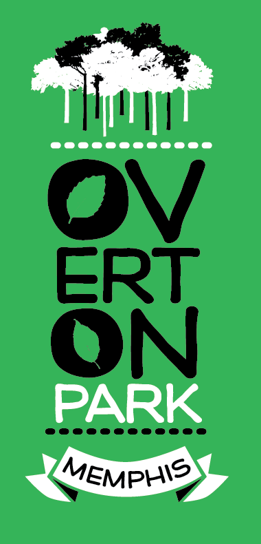
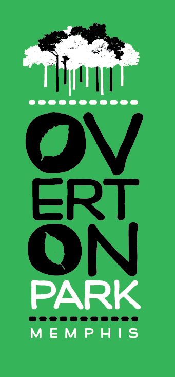
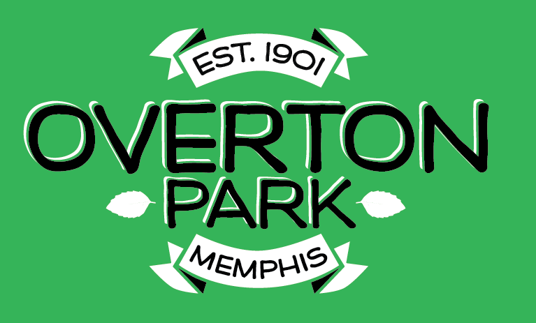
*Limited Edish* Overton Park shirts
Overton Park is a big, green breath of fresh air, in the middle of ever-evolving Midtown, just off the traffic-laden Poplar Avenue. Home to Memphis College of Art, the Brooks Museum, the Levitt Shell, the Memphis Zoo, and a big ass golf course, there's plenty to see and do within its borders.

But the best part of the park to me, is the park itself. Overton has nature trails through the forest that seem like you're the only person for miles, green soft grass for laying yoga mats and blankets upon, and old tall trees that shade half the Greensward at the right time of day.

I designed these shirts to showcase my favorite aspect of the park—the stoic skyline of peaceful trees.

The designs were printed on adult and youth tees, and included as a 2014 perk of becoming a member of the Overton Park Conservancy.

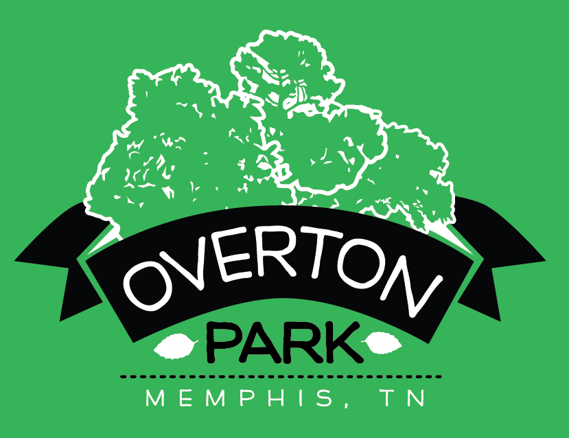
Unused ideas along the way.

I'm Mighty Fuckin' Sweet, Y'all
Logo ideas for Mighty Sweet, a would-be ultra-feminine one-woman cupcake-baking operation. I put together this branding system and series of logo variations on request from the then-boyfriend/now-husband of the little baker to give her on Christmas.


That Time I Illustrated Stoned Animals
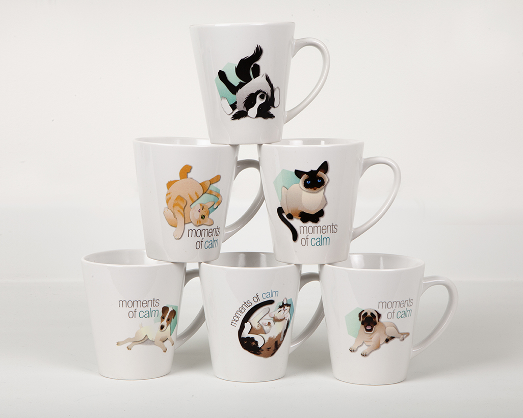
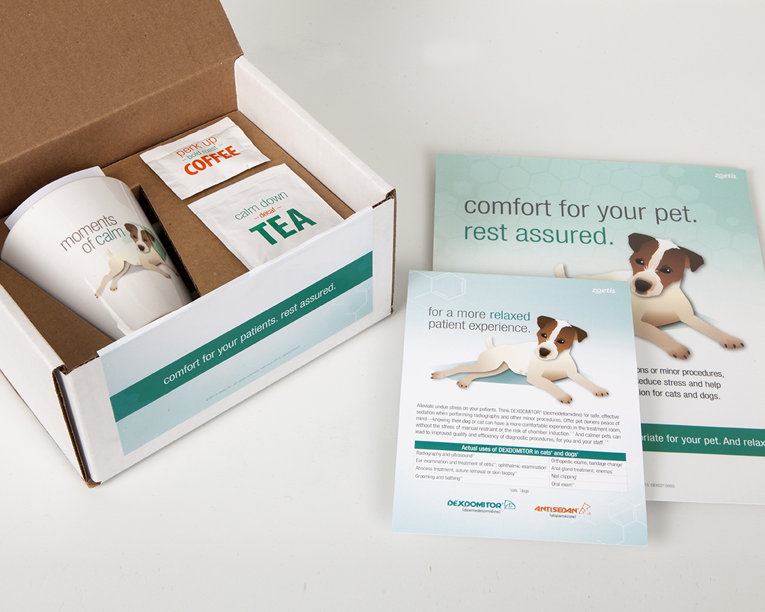
I developed this series of vector illustrations for Archer>Malmo for their client Pfizer, they were used in promotional materials for a pet sedative. Art direction chose these specific dog and cat breeds because they are known for hyperactivity and/or agitation. My job was to illustrate each breed in a calm, docile... and highly-medicated moment.


One of several pages of initial sketches I sent to the art direction team at AM; supplemental breed photo reference provided by the team; finished illustration of the Bullmastiff breed of dog, who can be prone to anxiety, looking chill af.

Craig Brewer is a Really Nice Guy!
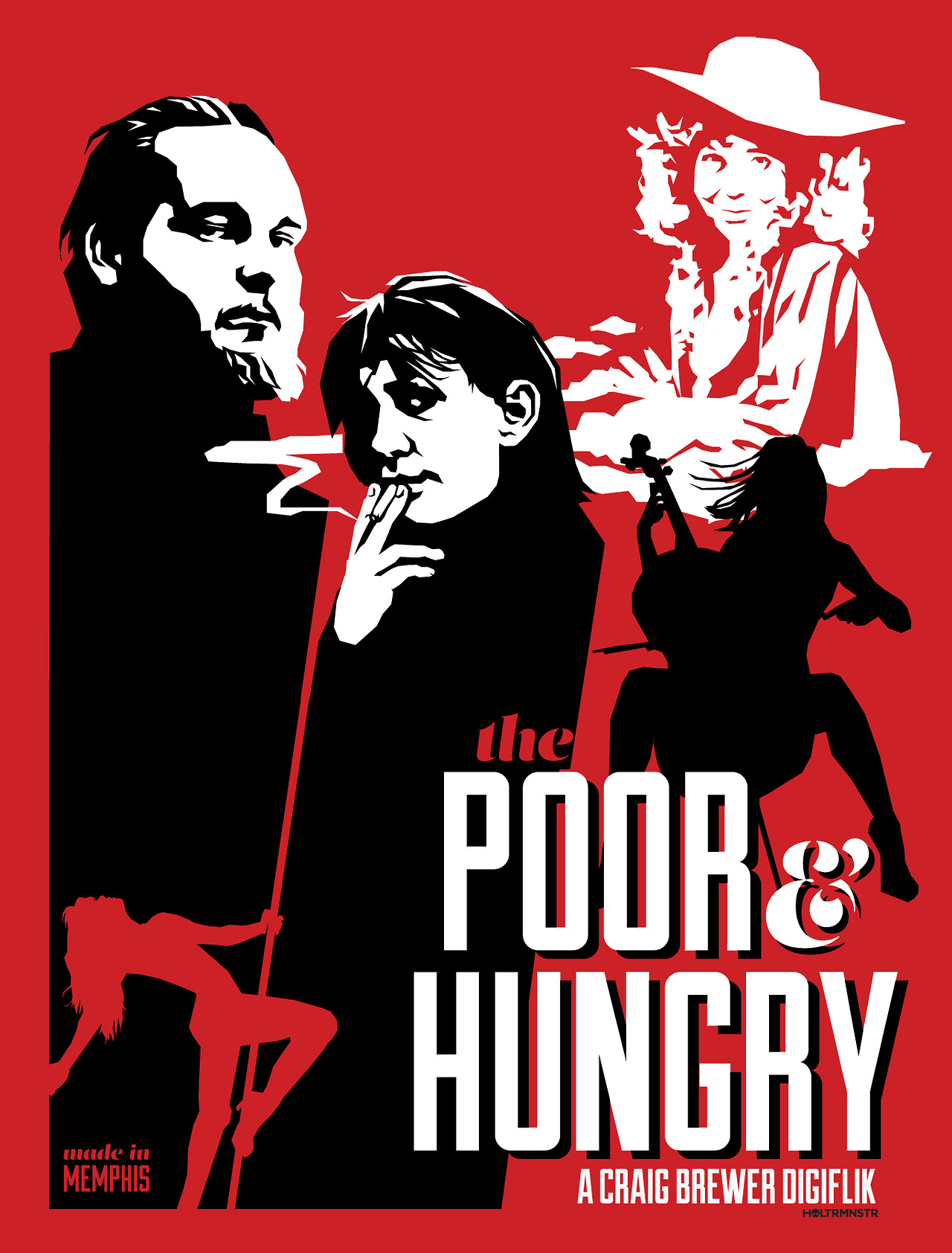
I designed this limited edition silkscreened art print for filmmaker Craig Brewer for the DVD release of his first feature film, The Poor & Hungry. He’s finally putting out all kinds of merch for his debut full-length (made way back in 2000) and he kindly commissioned me again! You might remember the poster I designed back in June for his short film, Clean Up In Booth B. —>

Memphis Flyer Let Me and Ronnie Vandalize a Box!

I painted another Memphis Flyer box! This year I collaborated with my favorite type slayer Ronnie Lewis to design, cut and spray these huge 4 color stencils of the iconic grocer pig from the beloved (now locally extinct) chain of Piggly Wiggly stores–the first of which opened in 1916 right here in Memphis, TN. The box’s new permanent home is on Union Avenue at Cooper in front of Ike’s, and you can vote for ERF as your favorite and help us win 500 cash money dollars.
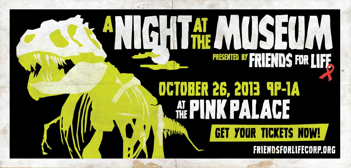
Let's Make AIDS Ancient History

Friends for Life aims to be the provider of hope, help, and healing for Mid-Southerners affected by HIV/AIDS until ultimately HIV/AIDS is cured and they can proudly cease to exist.
A Night At The Museum was the theme for 2013's annual Halloween fundraiser.
billboard design
I'm on Cotton Bureau!
My vintage media ephemera design made onto Cotton Bureau! Fans can vote for designs by preordering a shirt, and should it hit 25 orders, it'll go to print!


In-progress
The Original Black Lodge Video T-Shirt

T-shirt design for Black Lodge Video, the last video rental store in Memphis and my personal favorite place to be.
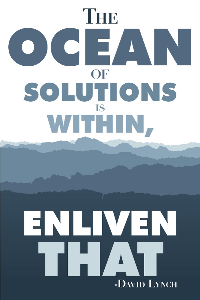
Early Morning Encouragement from David Lynch
David Lynch quote from an interview I listened to this morning.
Vintage Brewer: Clean Up In Booth B
Craig Brewer commissioned me to do a limited edition screen printed run of posters for the long-awaited release of his 2000 short film Clean Up in Booth B.
When Craig was getting his start, he didn't have the capital to release his first films on DVD. Now thirteen years later, he's doing it!
Drew Binkley at Grand Palace printing in Nashville printed these perfectly!
I Branded A Whole Film Festival and All I Got Was This Lousy T-Shirt
Just kidding! It was a total blast getting to take over the branding for the On Location: Memphis International Film & Music Festival. This local film fest is in its 14th year, and I updated their graphics a bit for this year's campaign.
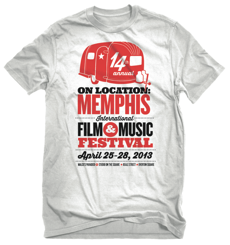
shirt design (above); spreads from festival program (below)
various sized ads for local publications (above); a cohesive set of passes, each still easily identifiable from afar (below)
For Ronnie (Both Lewis + James Dio)

Collaboration with Joshy B. (ERF/Electric Beef) for Ronnie’s birthday show at the Hi-Tone on February 21st!

Oops, I Accidentally Art Directed a Massive Volunteer Rebrand
Spent my whole Saturday at AIGA Memphis' Creatathon at Simple Focus working with designers & copywriters on identity/branding/web/print for the Mid-South Food Bank’s Miles for Meals 5K in September. And it was awesome!

I was scheduled to help with shirt design for a couple hours in the middle of the event, but when I arrived, art directors were still sitting around a conference table tossing around Pantone swatches and concepts. And without a logo, there was a room full of professionals being unused! My experience branding 5K events on the fly at Bluff City Sports came in handy, and I created this branding system in about an hour. I quickly prepped files and packaged fonts, and within no time, an entire team of talented creatives were working with my assets to create a website, merchandise design, and promotional materials. It was pretty goddamn exhilarating!
It didn't take long to create the branding, and the team took it from there!